 English
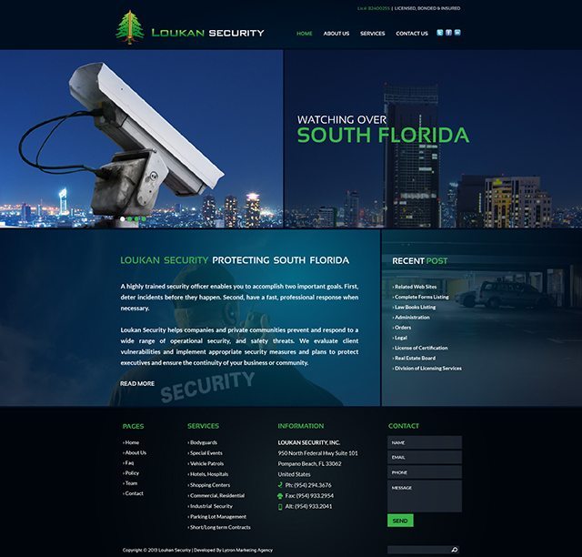
Security Company Website Design
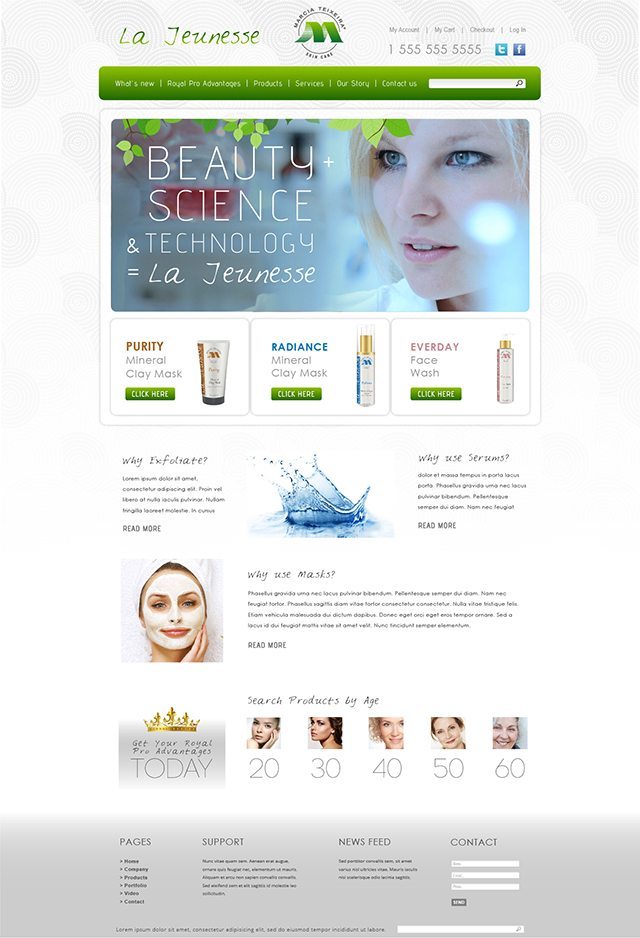
Skincare Website Design
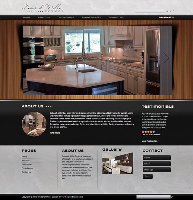
Interior Design Website
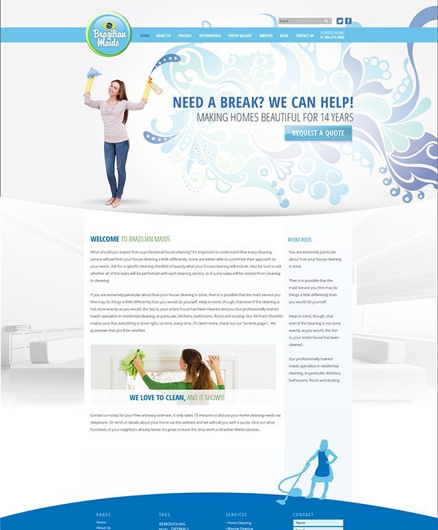
Cleaning Service Website Design
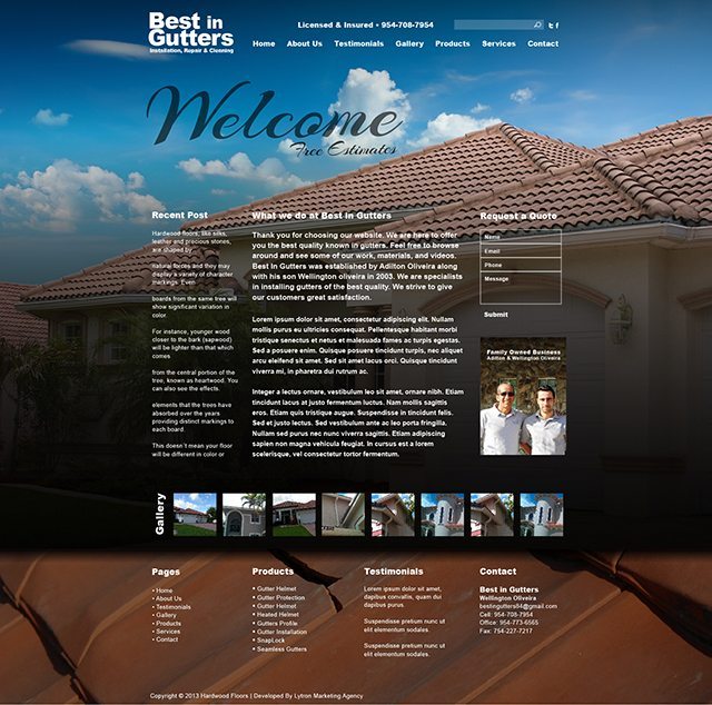
Gutter Installation, Repair, & Cleaning Website Design
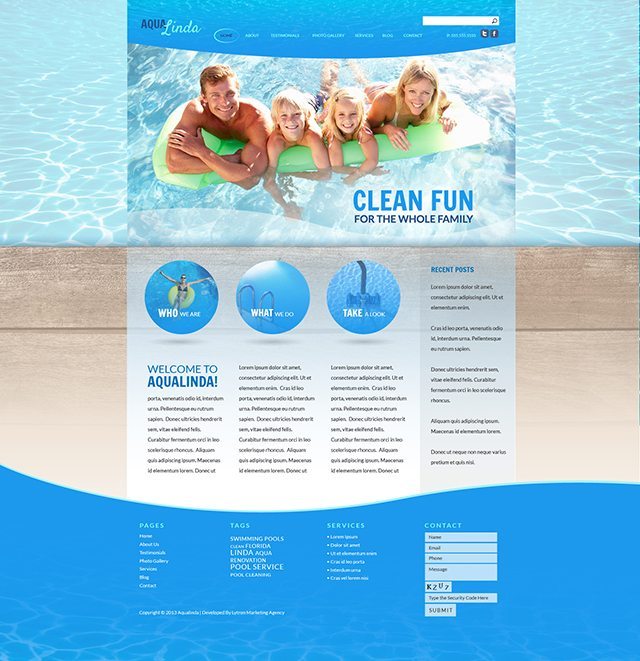
Pool Service Website Design
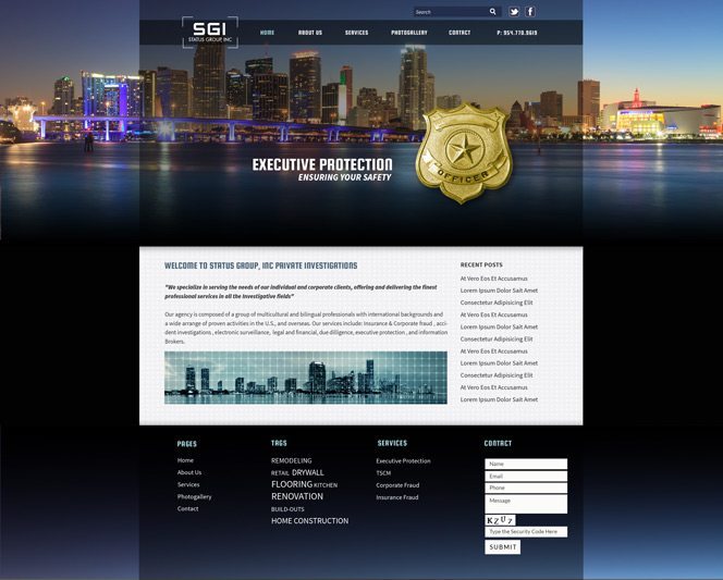
Private Investigation Website
This website design is bold and sophisticated with its darker tones and subtle use of transparencies and eye catching images. The layout is very user friendly and easy to navigate.
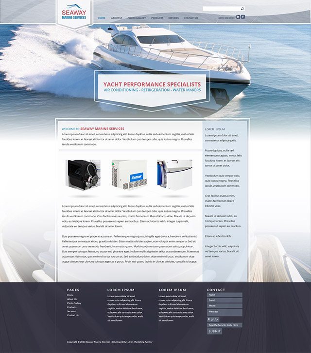
Read MoreYacht Website Design
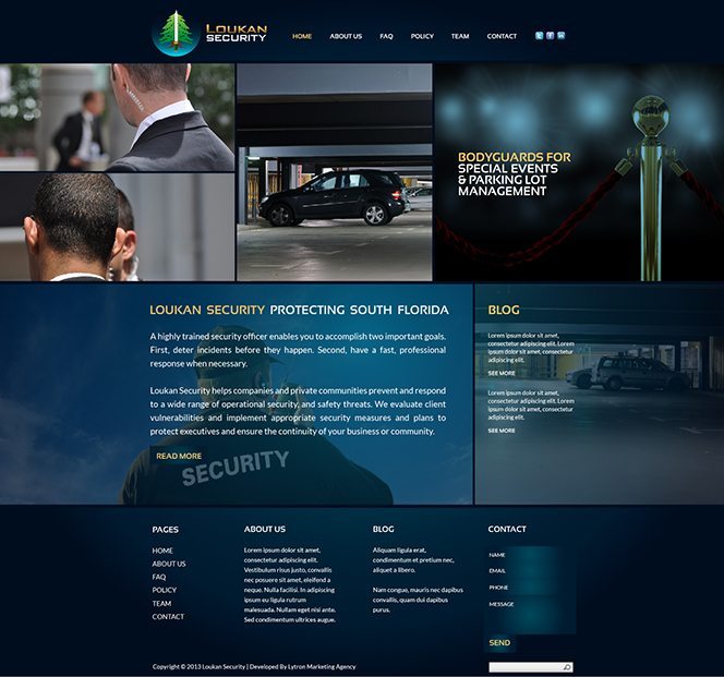
Security Website Final Design
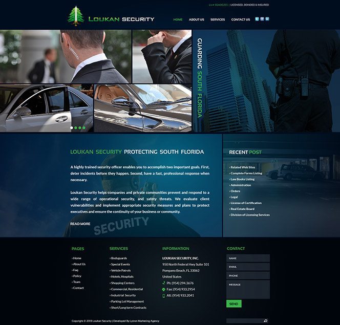
Inspiration from this site came from Piet Mondrian’s Composition II in Red, Blue, and Yellow, 1930. The reason for this was to illustrate the multiple aspects of the service offered and allude to the idea of picture frames and snapshots. The colors or dark blue give a sophisticated and serious dimension to the site and the contrasting goldish yellow color brings some balance to the overall aesthetic.
Read MoreEnergy and Power Company Website Design
LED Technology website design
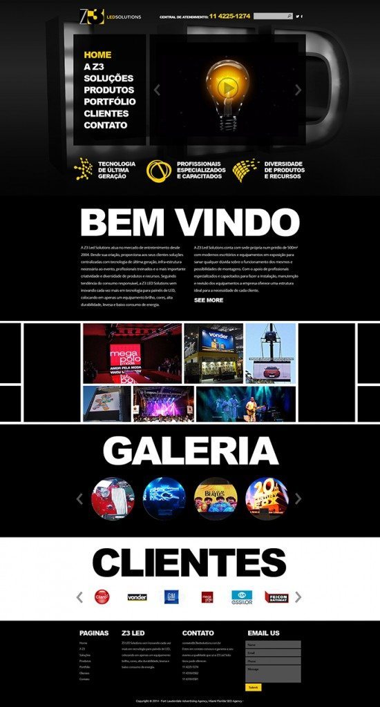
This site is modern and bold. The bold, white, sans-serif text on the black background makes this site feel new and exciting.
Read MoreVitamin & Supplement Company Website Design & Video
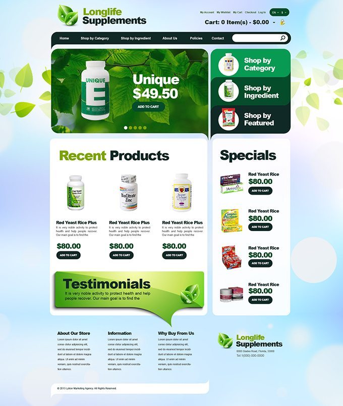
This design is clean and bright. The light blue and bright green create a sense of health which encourages the user's interest in the product.
Read MoreSecurity Company Website
Inspiration from this site came from Piet Mondrian's Composition II in Red, Blue, and Yellow, 1930. The reason for this was to illustrate the multiple aspects of the service offered and allude to the idea of picture frames and snapshots. The colors or dark blue give a sophisticated and serious dimension to the site and the contrasting goldish yellow color brings some balance to the overall aesthetic.
Read MoreConstruction Website
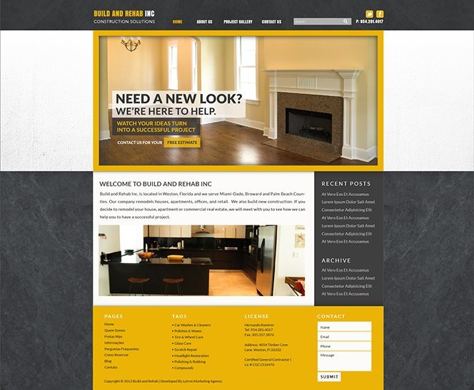
This site was inspired by construction materials. The multiple textures add depth, and the pop of yellow alludes to construction tape / hats. Overall the goal of the site is to showcase quality construction and remodeling. The site was too dark /serious without the yellow. The yellow was added to make the site feel modern and provide contrast.
Read MoreWoodwork Company Design
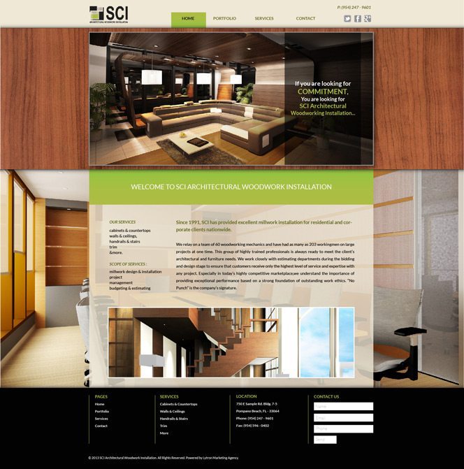
Design Inspiration / Research : We researched other woodworking companies to see what is trending right now. We incorporated texture and a pop of color to make this site stand out. Design Layout: We wanted this website to really showcase their craft, so we incorporated many images into the homepage (sliders, background image, and wood texture). It added depth and provided more opportunity for a potential client to visualize results. Colors: We used warmer, darker tones (like...
Read MoreTrade and Finance Company
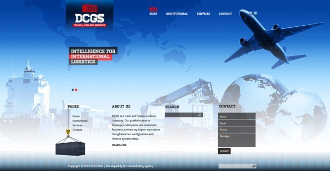
Design Inspiration/Research: Most companies in the industry of trading and finance are dull and lackluster. We wanted to create a site that would be bright and full of life. Colors: This site with its blues, reds and whites gave a lively aesthetic and the visual elements such as the containers, ships and planes communicated the nature of the client's site. Design/Layout: The site was designed to have little to no scrolling so that the viewer would see everything as a whole withou...
Read MoreAlliance Postcard
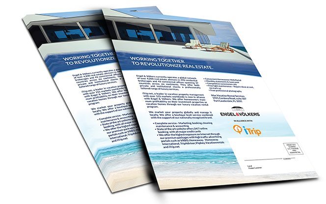
This postcard was created to announce two real estate companies working together. The specialize in different areas and by working together they are better helping their clients. Overall, I wanted to maintain a unified feel even though two different brands were merging together.
Read MoreLytron Brasil Welcome Kit
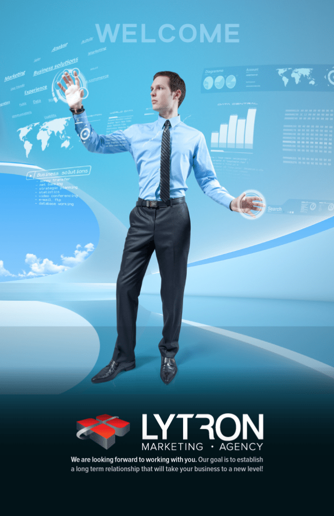
Here is the cover of our new welcome kit! Stay tuned for more...
Read MoreACC Website Mockup
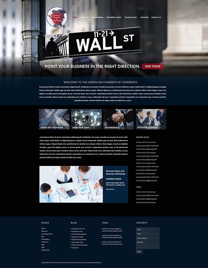
This site was inspired by the iconic American Dream/American Business. I incorporated Wall Street because the term has become a representation for the financial markets of the United States as a whole. Overall, I wanted the site to convey classic corporate America, but also appear expensive and sophisticated
Read MoreWPS CAR RENTAL LUXURIOUS DESIGN
This design is a sophisticated take on the WPS brand. The colors and overall design give a modern and luxurious aesthetic. Little highlights in the site makes the feeling of luxury and elegance even more present.
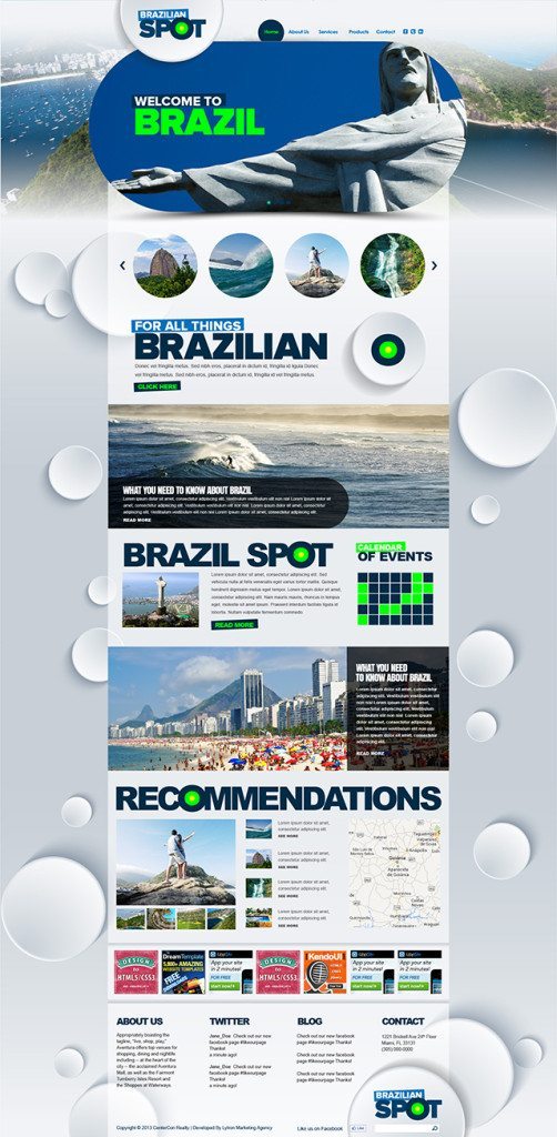
Read MoreTravel Website Design
Mowaa Website Makeover
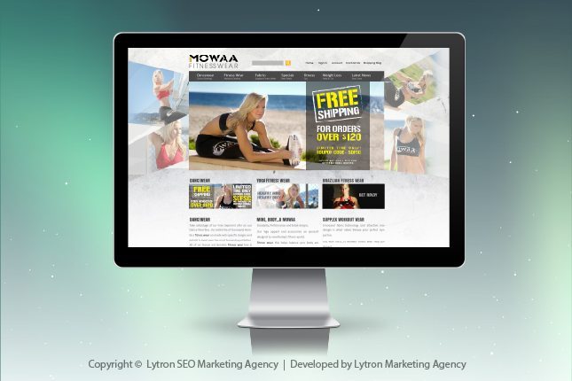
We've redesigned Mowaa site to feel "active" since, after all, they are selling active wear. The free flowing shapes on the side give the site movement. Overall, we gave the site an updated, modern feel.
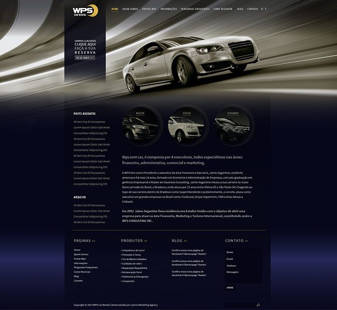
Read MoreCar Rental Website
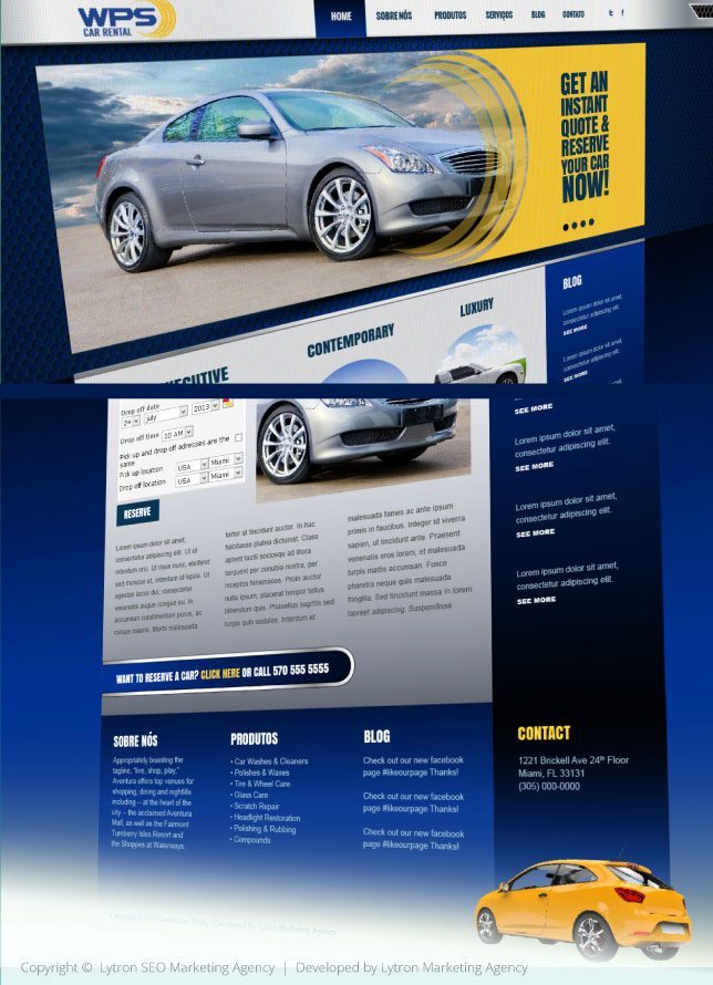
This design follows the same brand identity of WPS Consulting but with a focus on car design with elements of carbon fiber and silver trimmings. The colors and layout give it a modern yet corporate design that will appeal to the sensibilities of the users.
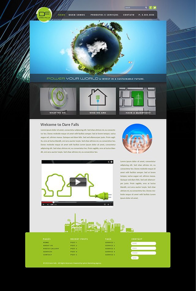
Read MoreDare Falls
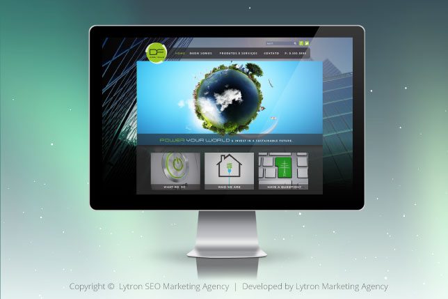
This website was inspired by the idea of clean, modern energy. I wanted it to have a futuristic/urban feel, but also maintain a natural/earth focused quality (this inspired the blue/green color scheme). Using rounded elements also helped achieve a futuristic feel.
Read More